Autor: Mag. Sandra Seck
Making information accessible to all is not just an aspiration, it is a legal requirement. People with impairments also want to use digital media, which is why we take care to design content that is understandable and readable for all.
Anyone who wants to realize the guiding principle of inclusion and create a positive user experience will not be able to avoid removing existing barriers to their content in the medium term. Not only because of the advancing demographic change. Almost 15 to 25 percent of all people are affected by disabilities or limitations, permanently or at least once in their lives. Austria alone has 300,000 blind or visually impaired people (according to BSVÖ, the Austrian Association for the Blind and Visually Impaired). With an auditory, motor, speech or cognitive disability, everyday life becomes a challenge - and that includes communicating on the Web.
Because insufficient color contrasts, websites that can only be operated with a mouse or missing text alternatives become an insurmountable obstacle, we convert websites and landing pages accordingly. Obstacle-free digital content is also search engine friendly and a good SEO measure: Google rewards user-friendly websites and gives them a better ranking. And with improved usability and messages that come across as easy to understand, you can achieve a higher reach. But accessible PDFs also require adjustments like tagging images or graphics with alt attributes so they can be read.
What are accessible PDFs?
Accessible content is defined by its perception, usability, understandability, and robustness - its compatibility for a variety of user agents. Assistive technologies are used to simplify access to digital content. With assistive technologies such as reading software and eye or voice control, PDFs can be used by cognitively impaired users, but for them to function without errors, the media provided must comply with certain guidelines and provide for suitable interfaces. There are technical standards that provide a framework for this. They ensure, for example, that accessible PDF files can be read aloud by a screen reader or that sufficient color contrasts are provided in the screen design.
Our checklist for accessible PDFs is especially helpful for new projects. Download it now for free.
This is the legal situation
What are the legal requirements in this regard? The Web Accessibility Act (WZG) prescribes the barrier-free design of digital information of the federal government, i.e. public bodies, in order to allow all people to participate in social life. The Web Content Accessibility Guidelines 2.1. (WCAG 2.1) state basic principles, guidelines, success criteria and recommend techniques for accessible web pages, non-web documents and software. PDF/UA was long considered the global standard for PDF accessibility, but it defines only the technical requirements and has since been integrated into WCAG. It does not guarantee that a PDF is actually accessible, as it does not address understanding in the text beyond the technical. Equality for people with disabilities is constitutionally guaranteed and requires accessibility for all services and information intended for the public.
Design for All
When creating accessible PDF files, there are many criteria to meet. Design solutions can be found for all challenges, but sometimes it can escalate into a costly and time-consuming endeavor. How the information is processed plays a role here. Is it structured in a way that is understandable and comprehensible to everyone, or do certain things need to be explained separately? The style of language is also important, as is the explanation of technical terms. CD colors, fonts, and type area should be user-friendly, as should pictures, diagrams, or tables, for which we seek alternatives to convey their contents.
Basically, the simpler and clearer the design, the easier it is to implement accessibility.
Sounds good. But also means that the demand on the design changes and you give up free creative leeway. The reduction to the most necessary and the guidelines restrict a creative design and development process and require a rethinking. The completely different approach throttles many a creative spontaneous idea or visual enhancement.
Required adaptations
How can we communicate accessibility in PDFs with typography, images, and text to improve readability for people with disabilities? From within Adobe InDesign, we can efficiently adapt PDFs to meet specific reading and comprehension needs. There are a number of things to consider, from the technical structuring of text to comprehensibility and typography. Our graphic designer Chris explains what is important: "A precise, structured layout is very important right from the start so that it can be implemented cleanly. Everything has to be tagged correctly to make the content readable for technical tools: Paragraph formats, but also images and foreign language passages, as well as artifacts that can be ignored. We need a descending headline hierarchy and alternative texts for all images relevant to the content. Overall, we need to check for every single element whether the information can be captured. After optimization, we go into testing, for example, whether all tables are created correctly and purely design elements are marked as extra-textual."
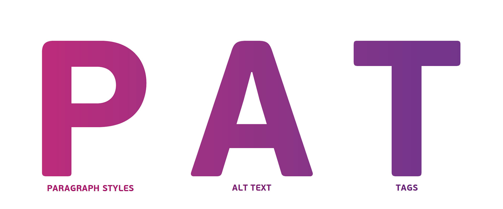
 Create accessible PDFs with PAT: paragraph styles, ALT-text and Tags
Practical implementation tips for graphic designers
If you want to save yourself unnecessary work, you should strategically prepare for new projects right from the start - and there are several steps you can take to make the workflow easier for graphic designers. The very first thing to do is to clearly define and create body text as a paragraph format. Page numbers or fixed elements that appear on every page, and anything that repeats on every page, are best put on the master page, because screen readers will ignore them there. And another important tip: All vector files from Illustrator should not be placed, but linked. After all, if the content is recognized as one graphic, only one alternative text needs to be created for it. Otherwise, each path would be seen as a separate object, resulting in a lot of extra work.
Interested in even more tips? Our checklist for accessible PDFs is especially helpful for new projects. Download it now for free.
back


 Create accessible PDFs with PAT: paragraph styles, ALT-text and Tags